Simulation and MCMC
To demonstrate the usage of the package, we can simulate some genotyping data according to our model, allowing for some relatedness within samples in the population.
set.seed(17325)

mean_moi <- 5
num_biological_samples <- 100
epsilon_pos <- .01
epsilon_neg <- .1
internal_relatedness_alpha <- .1
internal_relatedness_beta <- 1

# Generate 15 loci with 5 alleles each, and 15 loci with 10 alleles each
allele_counts <- c(rep(5, 15), rep(10, 15))

# We'll use flat alpha vectors for our draws from the Dirichlet
locus_freq_alphas <- lapply(allele_counts, function(allele) rep(1, allele))
simulated_data <- moire::simulate_data(
  mean_moi,
  num_biological_samples,
  epsilon_pos, epsilon_neg,
  locus_freq_alphas = locus_freq_alphas,
  internal_relatedness_alpha = internal_relatedness_alpha,
  internal_relatedness_beta = internal_relatedness_beta
)
Now that we have our data, let’s go ahead and run the MCMC. Here we run 20 parallel tempered chains with a temperature gradient ranging from . We also place a weak prior on relatedness that favors low relatedness.
burnin <- 1e3
num_samples <- 1e3
pt_chains <- seq(1, 0, length.out = 80)
pt_num_threads <- 20 # number of threads to use for parallel tempering

mcmc_results <- moire::run_mcmc(
  simulated_data,
  verbose = TRUE, burnin = burnin, samples_per_chain = num_samples,
  pt_chains = pt_chains, pt_num_threads = pt_num_threads,
  adapt_temp = TRUE
)
After running the MCMC, we can access the draws from the posterior distribution and analyze.
# Estimate the COI for each sample
coi_summary <- moire::summarize_coi(mcmc_results)

# We can also summarize statistics about the allele frequency distribution
he_summary <- moire::summarize_he(mcmc_results)
allele_freq_summary <- moire::summarize_allele_freqs(mcmc_results)
relatedness_summary <- moire::summarize_relatedness(mcmc_results)
effective_coi_summary <- moire::summarize_effective_coi(mcmc_results)

# Let's append the true values for use later
sample_data <- data.frame(
  coi_summary, effective_coi_summary, relatedness_summary,
  true_coi = simulated_data$sample_cois,
  true_effective_coi = (simulated_data$sample_cois - 1) * (1 - simulated_data$sample_relatedness) + 1,
  # relatedness is 0 when COI is 1
  true_relatedness = simulated_data$sample_relatedness * (simulated_data$sample_cois > 1)
)

he_data <- data.frame(
  he_summary,
  true_he = sapply(
    moire::calculate_naive_allele_frequencies(simulated_data$true_genotypes),
    function(x) moire::calculate_he(x)
  ),
  naive_he = sapply(
    moire::calculate_naive_allele_frequencies(simulated_data$data),
    function(x) moire::calculate_he(x)
  )
)

allele_freq_data <- data.frame(
  allele_freq_summary,
  naive_allele_frequency = unlist(
    moire::calculate_naive_allele_frequencies(simulated_data$data)
  ),
  true_allele_frequency = unlist(
    moire::calculate_naive_allele_frequencies(simulated_data$true_genotypes)
  )
)
Estimating COI
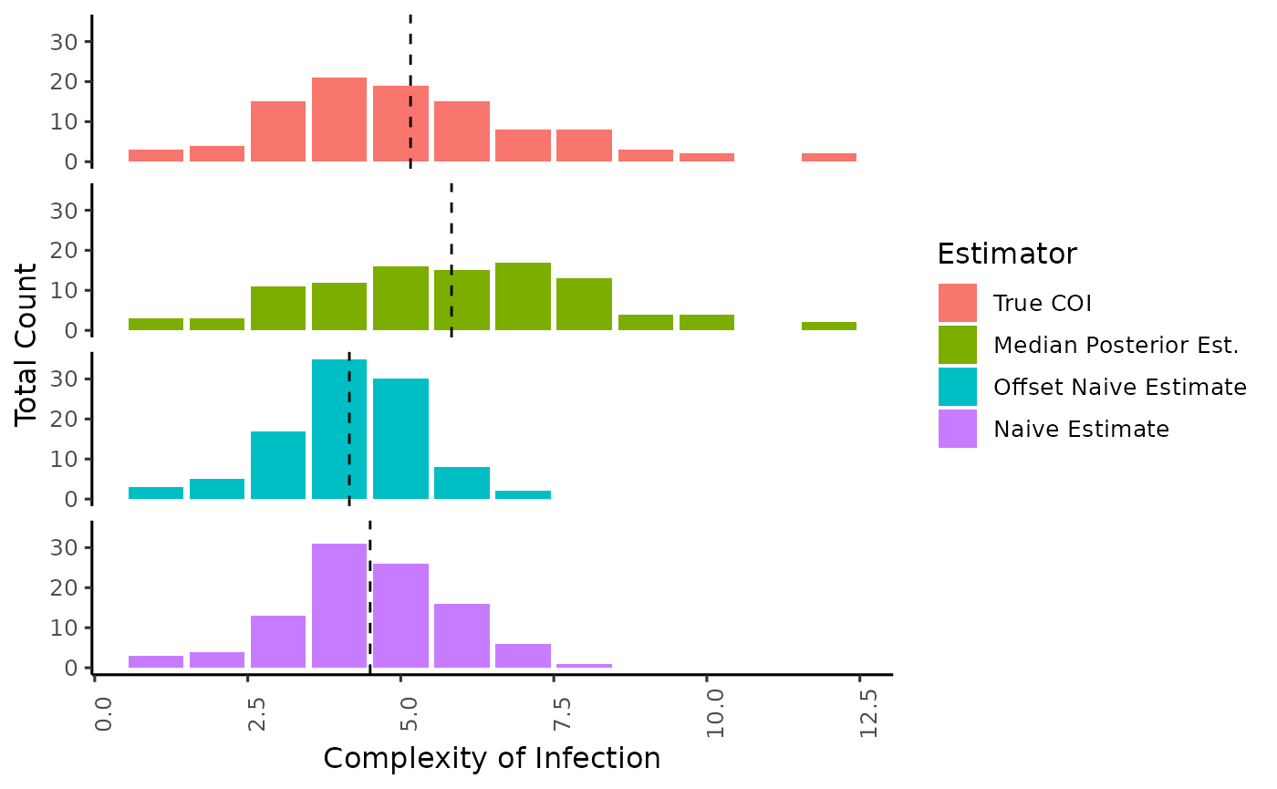
Here we demonstrate the difference in distribution of the estimate of COI using our approach vs the naive method of taking the maximum number of alleles observed (Naive Estimate), or the second highest number of alleles observed (Offset Naive Estimate). Mean of the distribution is annotated by a dotted line.
coi_estimates <- sample_data |>
  dplyr::select(post_coi_med, naive_coi, offset_naive_coi, true_coi, sample_id) |>
  tidyr::pivot_longer(-sample_id,
    names_to = "estimator",
    values_to = "estimate"
  ) |>
  dplyr::mutate(estimator_pretty = dplyr::case_when(
    estimator == "post_coi_med" ~ "Median Posterior Est.",
    estimator == "naive_coi" ~ "Naive Estimate",
    estimator == "offset_naive_coi" ~ "Offset Naive Estimate",
    estimator == "true_coi" ~ "True COI"
  )) |>
  transform(estimator_pretty = factor(estimator_pretty, levels = c(
    "True COI",
    "Median Posterior Est.",
    "Offset Naive Estimate",
    "Naive Estimate"
  )))

coi_estimate_summaries <- coi_estimates |>
  dplyr::group_by(estimator_pretty) |>
  dplyr::summarise(mean = mean(estimate))

ggplot() +
  geom_bar(data = coi_estimates, aes(x = estimate, group = estimator_pretty, fill = estimator_pretty, after_stat(count))) +
  geom_vline(data = coi_estimate_summaries, aes(xintercept = mean, group = estimator_pretty), linetype = "dashed") +
  facet_wrap(~estimator_pretty, ncol = 1) +
  xlab("Complexity of Infection") +
  ylab("Total Count") +
  labs(fill = "Estimator") +
  theme_classic(base_size = 12) +
  theme(
    axis.text.x = element_text(angle = 90),
    strip.background = element_blank(),
    strip.text = element_blank()
  )
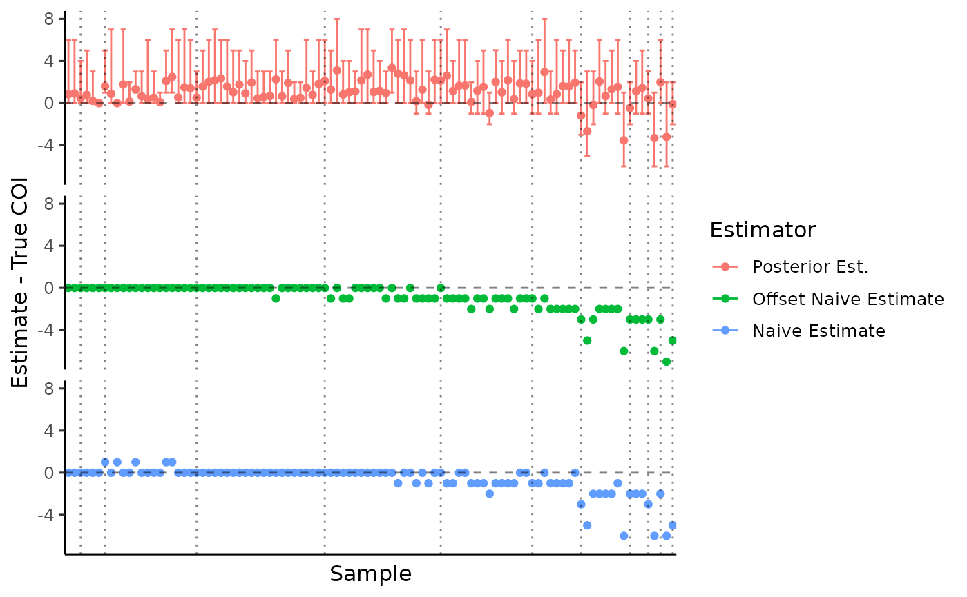
Since we simulated data, we know the true complexity of infection and can compare to our estimates. Observations are ordered by COI with dotted lines delimiting the total COI.
coi_compare_to_truth <- sample_data |>
  dplyr::select(post_coi_mean, naive_coi, offset_naive_coi, true_coi, sample_id, post_coi_lower, post_coi_upper) |>
  tidyr::pivot_longer(c(-sample_id, -true_coi, -post_coi_lower, -post_coi_upper),
    names_to = "estimator",
    values_to = "estimate"
  ) |>
  dplyr::mutate(
    estimator_pretty = dplyr::case_when(
      estimator == "post_coi_mean" ~ "Posterior Est.",
      estimator == "naive_coi" ~ "Naive Estimate",
      estimator == "offset_naive_coi" ~ "Offset Naive Estimate"
    ),
    sample_id = forcats::fct_reorder(sample_id, true_coi, min),
    ymin = dplyr::case_when(
      estimator == "post_coi_mean" ~ post_coi_lower - true_coi,
      estimator == "naive_coi" ~ estimate - true_coi,
      estimator == "offset_naive_coi" ~ estimate - true_coi
    ),
    ymax = dplyr::case_when(
      estimator == "post_coi_mean" ~ post_coi_upper - true_coi,
      estimator == "naive_coi" ~ estimate - true_coi,
      estimator == "offset_naive_coi" ~ estimate - true_coi
    )
  ) |>
  transform(estimator_pretty = factor(estimator_pretty, levels = c(
    "Posterior Est.",
    "Offset Naive Estimate",
    "Naive Estimate"
  ))) |>
  dplyr::arrange(true_coi)

coi_bins <- sample_data |>
  dplyr::group_by(true_coi) |>
  dplyr::summarize(n = dplyr::n()) |>
  dplyr::mutate(pos = cumsum(n))


ggplot(
  data = coi_compare_to_truth,
  aes(
    x = sample_id, y = estimate - true_coi, ymin = ymin, ymax = ymax,
    group = estimator_pretty, color = estimator_pretty
  )
) +
  geom_errorbar() +
  geom_point() +
  facet_wrap(~estimator_pretty, ncol = 1) +
  geom_hline(yintercept = 0, linetype = "dashed", alpha = .5) +
  geom_vline(data = coi_bins, aes(xintercept = pos), linetype = "dotted", alpha = .5) +
  xlab("Sample") +
  ylab("Estimate - True COI") +
  labs(color = "Estimator") +
  theme_classic(base_size = 12) +
  theme(
    axis.text.x = element_blank(),
    axis.ticks.x = element_blank(),
    strip.background = element_blank(),
    strip.text = element_blank()
  )
Estimating effective COI
Since there is some underlying relatedness in the population, we might be actually be interested in the effective COI, a metric that adjusts for underlying within-host relatedness and allows for intermediate values of COI.
What is effective COI?
This metric can be interpreted as the expected number of alleles that would be observed within a sample at a locus with infinite diversity (i.e. ). In the case of zero within-host relatedness, every allele observed is unique and thus effective COi is equal to the actual complexity of the infection. As relatedness approaches 1, the expected number of alleles converges to 1 no matter the underlying true COI. It turns out that this relationship is linear, and can be expressed as where r is the probability of strains being related (and thus with identical genetics) across the genome. This results in a continuous metric that shrinks COI towards 1 as relatedness increases, and thus differences between mean COI and mean effective COI may be a signal of reduced diversity and increased in-breeding, suggesting cotransmission or highly localized transmission.
ggplot(sample_data, aes(x = true_effective_coi, y = post_effective_coi_mean, ymin = post_effective_coi_lower, ymax = post_effective_coi_upper)) +
geom_abline(slope = 1, intercept = 0, linetype = "dashed", alpha = 0.5) +
geom_errorbar() +
geom_point() +
xlab("True effective COI") +
ylab("Estimated effective COI ") +
theme_classic(base_size = 12) +
expand_limits(x = 1, y = 1)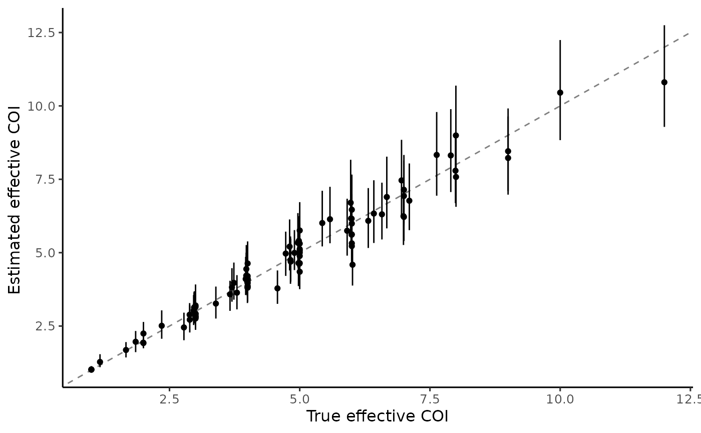 We can see that
 moire is able to accurately recover true
underlying effective COI despite the potential identifiability issues of
relatedness or COI independently. Next let’s estimate relatedness within
samples.
Estimating Relatedness
ggplot(
sample_data,
aes(x = true_relatedness, y = post_relatedness_mean, ymin = post_relatedness_lower, ymax = post_relatedness_upper)
) +
geom_abline(slope = 1, intercept = 0, linetype = "dashed", alpha = 0.5) +
geom_errorbar() +
geom_point(aes(size = post_effective_coi_mean)) +
xlab("True relatedness") +
ylab("Estimated relatedness ") +
labs(size = "Post. mean effective COI") +
theme_classic(base_size = 12) +
expand_limits(x = 1, y = 1)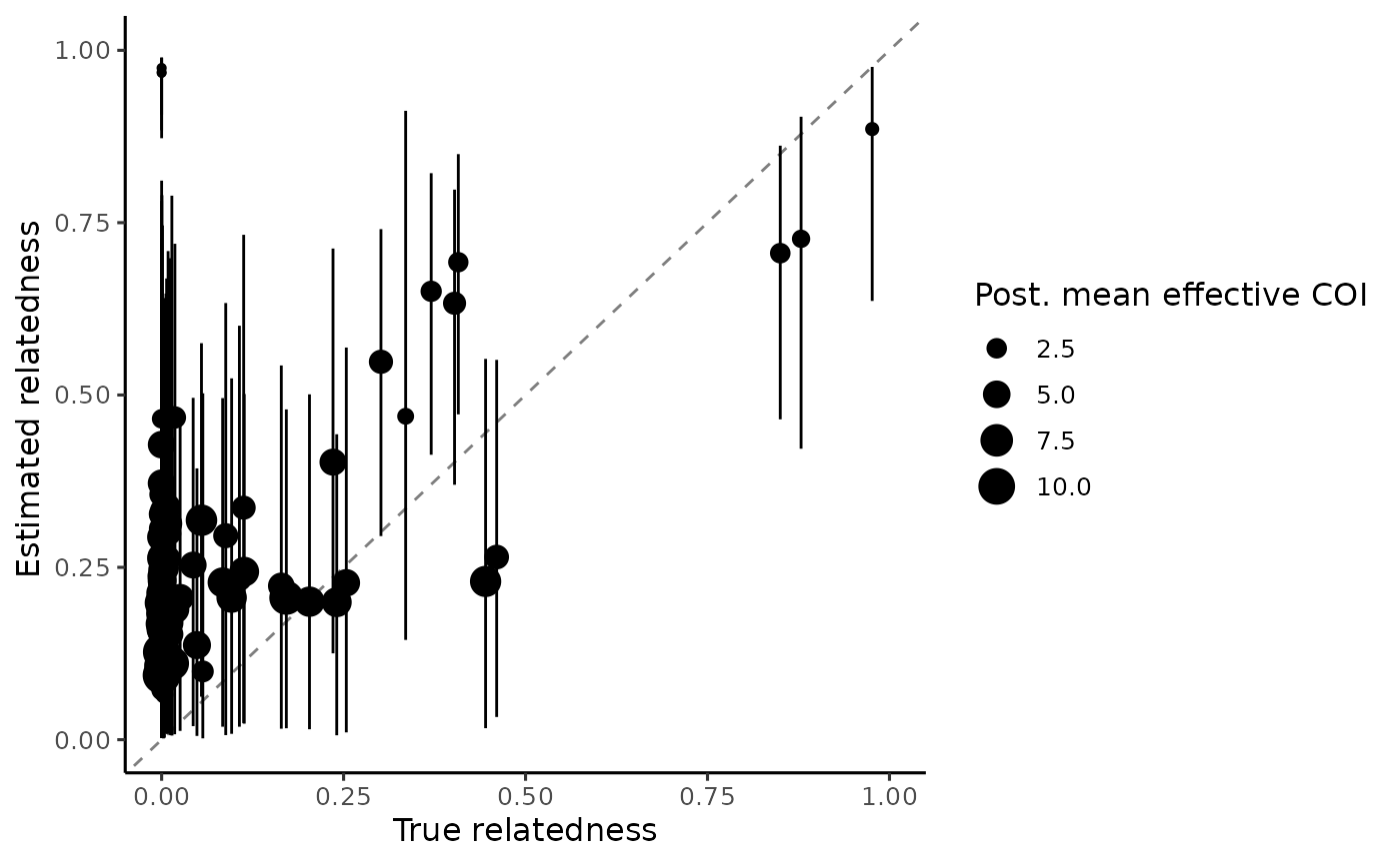 We see that the estimated relatedness per sample in general has wide
credible intervals, in particular for samples with low effective COI.
This is explained by the fact that lower COI samples have less
information available to actually estimate relatedness, and samples with
a true COI of 1 would have zero information because relatedness is an
undefined quantity. Further, we only use 30 loci in this example. We
would expect to see narrower credible intervals with more loci.
We see that the estimated relatedness per sample in general has wide
credible intervals, in particular for samples with low effective COI.
This is explained by the fact that lower COI samples have less
information available to actually estimate relatedness, and samples with
a true COI of 1 would have zero information because relatedness is an
undefined quantity. Further, we only use 30 loci in this example. We
would expect to see narrower credible intervals with more loci.
Estimating allele frequencies
ggplot(allele_freq_data) +
geom_errorbar(aes(
y = post_allele_freqs_mean,
x = true_allele_frequency,
ymax = post_allele_freqs_upper,
ymin = post_allele_freqs_lower
)) +
geom_point(aes(y = post_allele_freqs_mean, x = true_allele_frequency)) +
geom_point(aes(y = naive_allele_frequency, x = true_allele_frequency), color = "red", alpha = .3) +
geom_abline(slope = 1, intercept = 0, linetype = "dashed", alpha = .5) +
ylab("Mean Posterior Freqeuncy") +
xlab("True Frequency") +
theme_classic(base_size = 12) +
expand_limits(x = 0, y = 0) +
ggtitle("Estimates of Allele Frequencies vs Truth")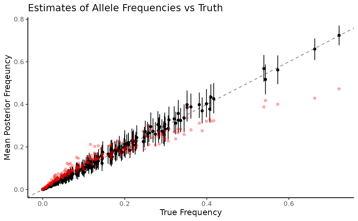 Again, naive estimation of allele frequencies (red) is heavily biased
and lacks any estimates of uncertainty. Allele frequencies are very well
estimated by MOIRE (black), recovering values from the entire range
along with measures of uncertainty at the 95% credible interval. Since
we have access to the full distribution of sample allele frequencies, we
can also look at distributions of other summary statistics that might be
of interest. For example, let’s take a look at expected
heterozygosity.
Again, naive estimation of allele frequencies (red) is heavily biased
and lacks any estimates of uncertainty. Allele frequencies are very well
estimated by MOIRE (black), recovering values from the entire range
along with measures of uncertainty at the 95% credible interval. Since
we have access to the full distribution of sample allele frequencies, we
can also look at distributions of other summary statistics that might be
of interest. For example, let’s take a look at expected
heterozygosity.
Estimating expected heterozygosity
ggplot(he_data, aes(x = true_he)) +
geom_errorbar(aes(y = post_stat_mean, ymax = post_stat_upper, ymin = post_stat_lower)) +
geom_point(aes(y = post_stat_mean), color = "black") +
geom_point(aes(y = naive_he), color = "red") +
geom_abline(slope = 1, intercept = 0, linetype = "dashed", alpha = .5) +
xlab("True Heterozygosity") +
ylab("Mean Posterior Heterozygosity") +
theme_classic()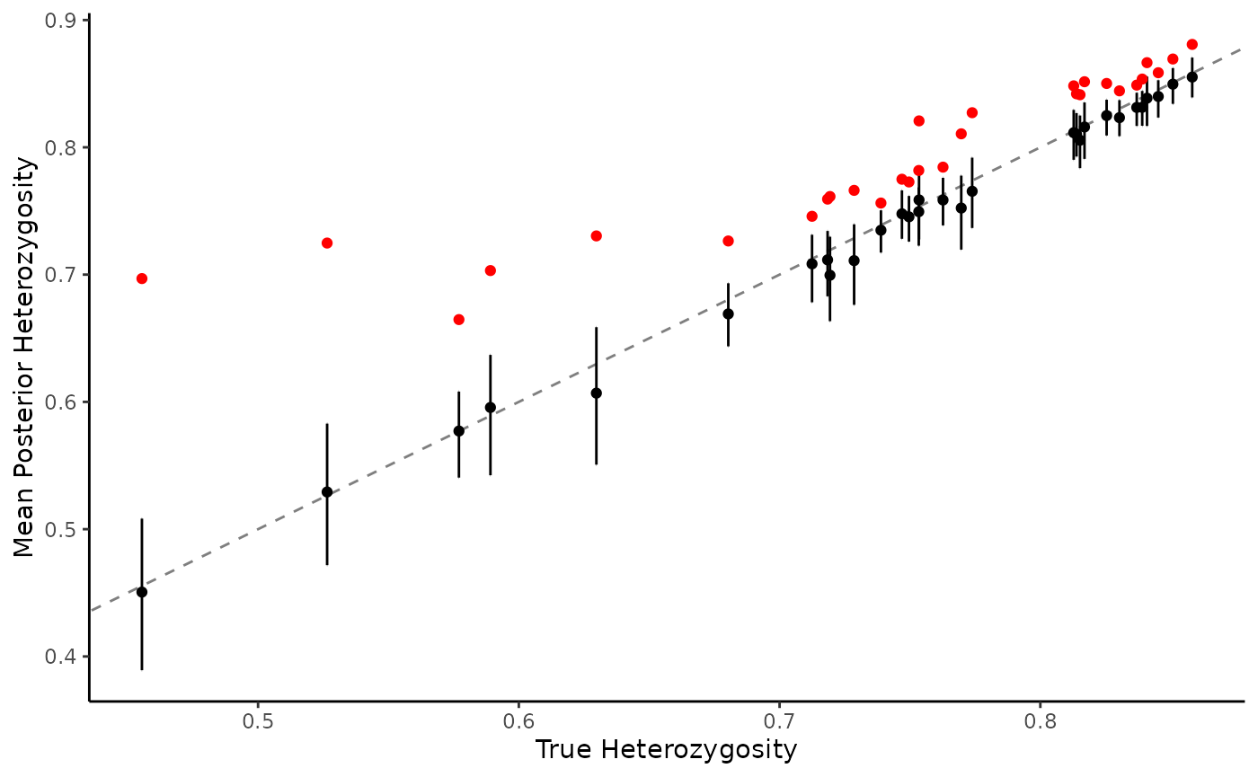 Naive estimation (red) results in a severe upward bias, especially at
lower levels of expected heterozygosity. MOIRE maintains high accuracy
(black), including measures of uncertainty at the 95% credible
interval.
Naive estimation (red) results in a severe upward bias, especially at
lower levels of expected heterozygosity. MOIRE maintains high accuracy
(black), including measures of uncertainty at the 95% credible
interval.